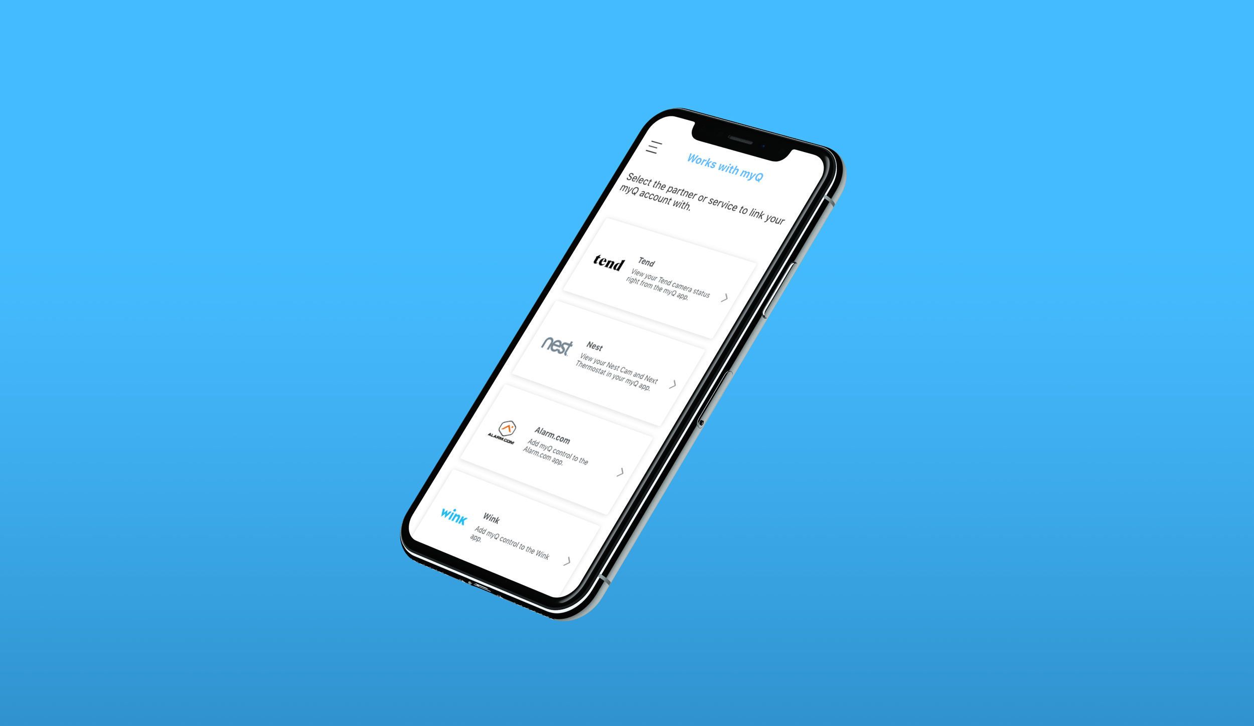
myQ Partner Portal Redesign Case Study
When carousels don’t work
In the myQ app, “Works with myQ” is the residential partner portal where users can integrate other apps and services such as Amazon Key, Google Nest, Alarm.com or Tesla in order to give users the flexibility to control their garage in apps or ecosystems they already use.
This year, Chamberlain has invested in the experience team to completely refresh the visual branding and experience in the myQ app to be more informational and easy-to-use for end-users. Unfortunately, our partner portal has not changed. This lack of design consistency throughout the app has caused a large number of complaints in the App Store and in Google Play.

Involvement
Competitive Analysis, User Testing, Validation Testing, High Fidelity Design
Deliverables
Userflow, Testing Report, Wireframes
Where We Began
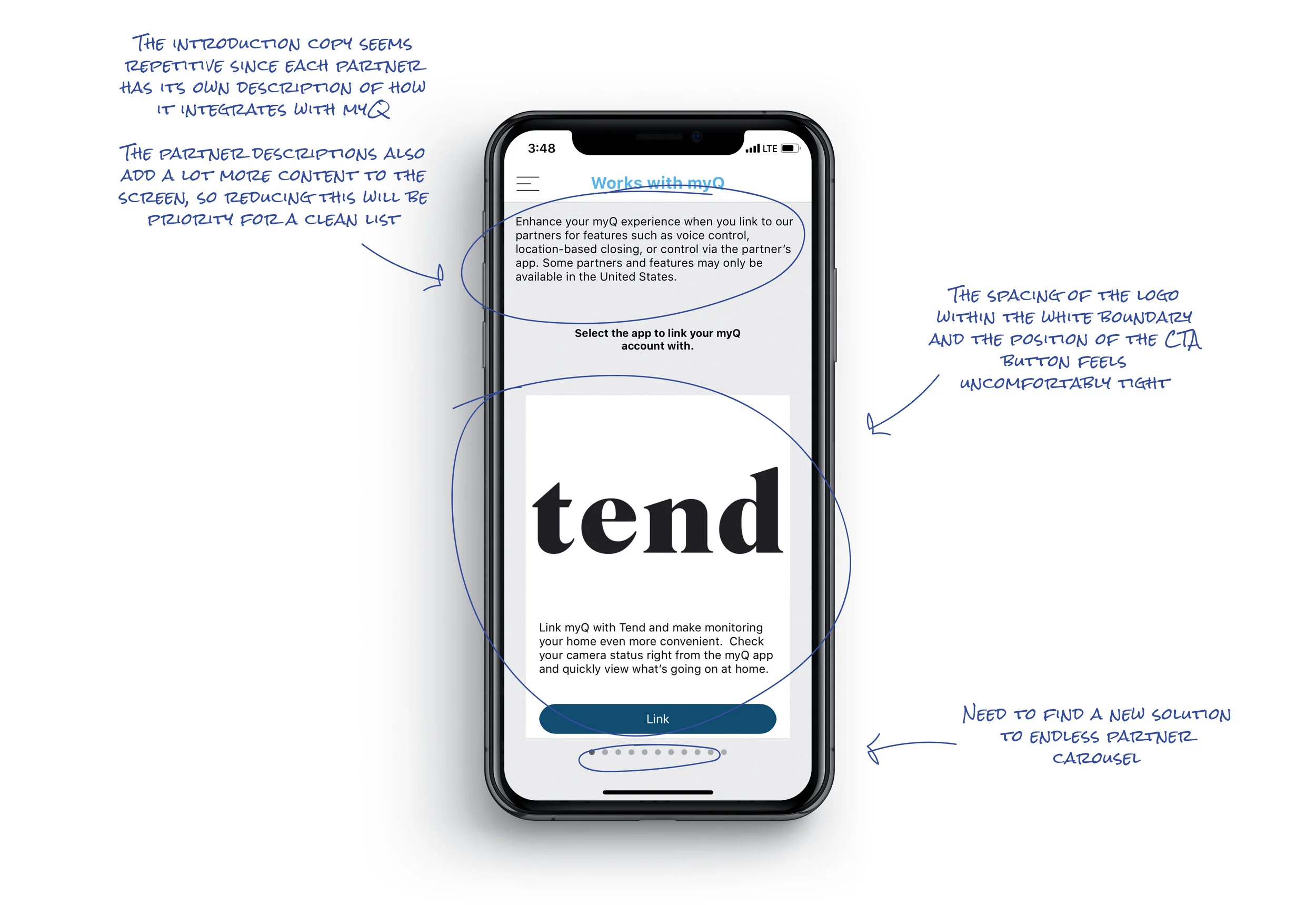
When going into the partner portal from the menu, it is clear to see where user friction is happening. The partners are listed in a carousel format and, as that list continues to grow, this causes the user to swipe endlessly. The challenge is to design a solution to our ever-growing partner list; one that can scale and also bring the entire portal up our current visual standards.

The carousel
👎
So, how can we improve?

Competitive Analysis
I took a look at several smart home competitors and indirect competitors that our myQ user base is already using to capture common design patterns and see how other apps solve for lists and overflow content.

Design Concepts
I took a few different approaches based on the design patterns I found. It’s important to consider design patterns that users are already familiar with using in their day-to-day to decrease friction.
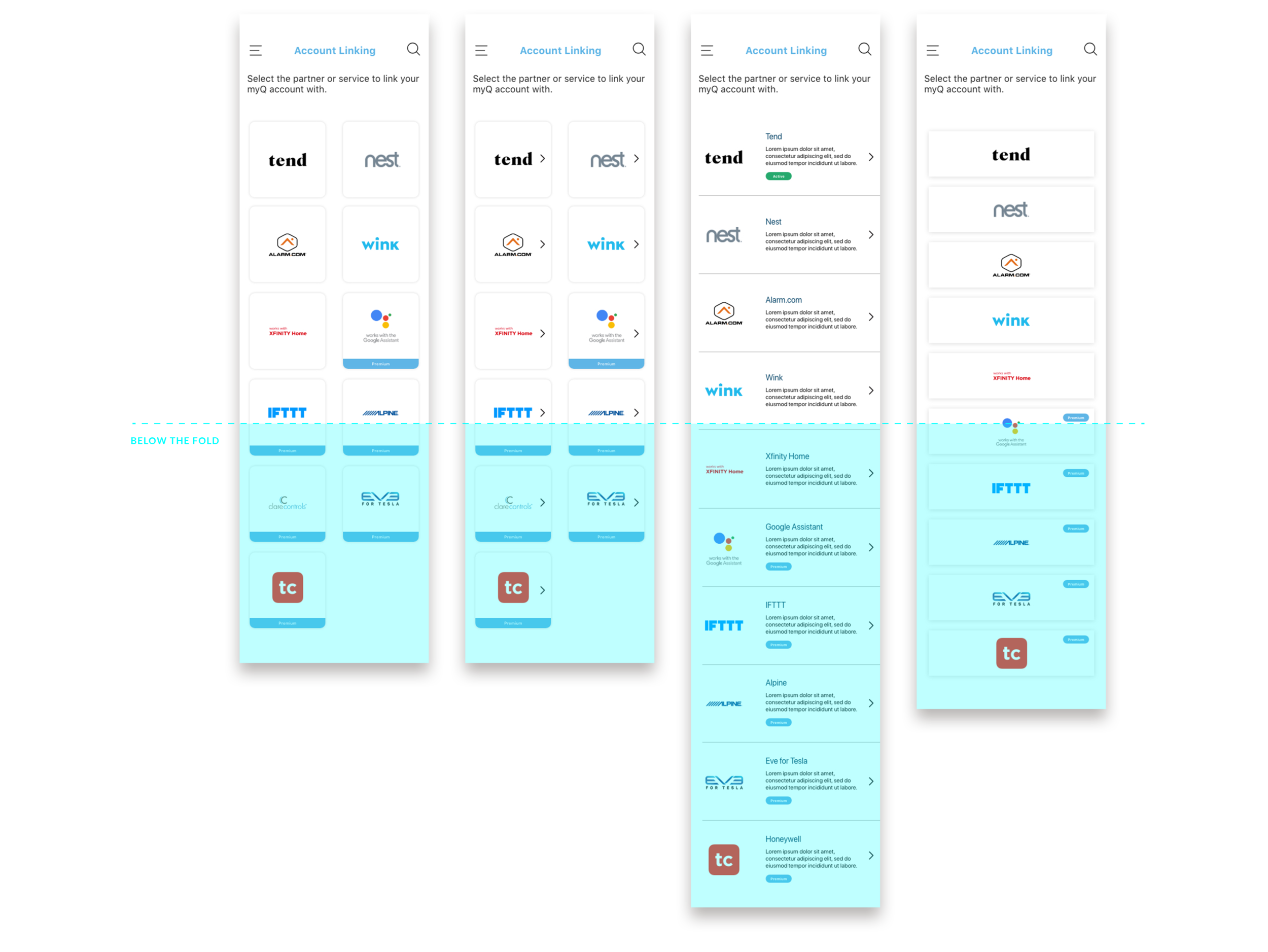
From left to right the options are: A, B, C & D
Option A: grid blocks
This option saves the most space and has less items that fall below the fold. A banner badge is used for our premium features to make it clear to users.
Option B: grid blocks, with arrows
This option is the same as Option A but includes arrows. The experience team is divided on whether arrows are helpful or unnecessary to users and this was great project to get testing around that hypothesis.
Option C: list view, with arrows
This option has the longest scroll and subsequently has the most content falling below the fold. (In part because of the added description copy) Based on competitor research, this was a very common design pattern. Instead of a banner-style badge, a pill-style badge is used to make it noticeable but not disruptive.
Option D: list view, logos only
I wanted to include another design pattern I saw for indirect competitors to see “how minimal is too minimal?” As a goal to improve our experience design at Chamberlain, these opportunities are great to test design strategies and use the results from our research to validate new ideas in the future.
Getting in front of users
There was a huge time constraint on this project and needed to be completed within 2-3 weeks. This included design time and testing. I worked with our design researcher to arrange in-person interviews with customers. It proved very difficult to schedule enough people (at least 5) to validate one design over the other, so we needed to execute an alternative plan.
That’s where Usability Hub comes in. This route proved to be a much more simple process. We were able to to add parameters such as age, tech savvy-ness, education level, etc. to recruit participants that matched our myQ user personas. I then created and uploaded a side-by-side preference test which asked the following questions:
1.
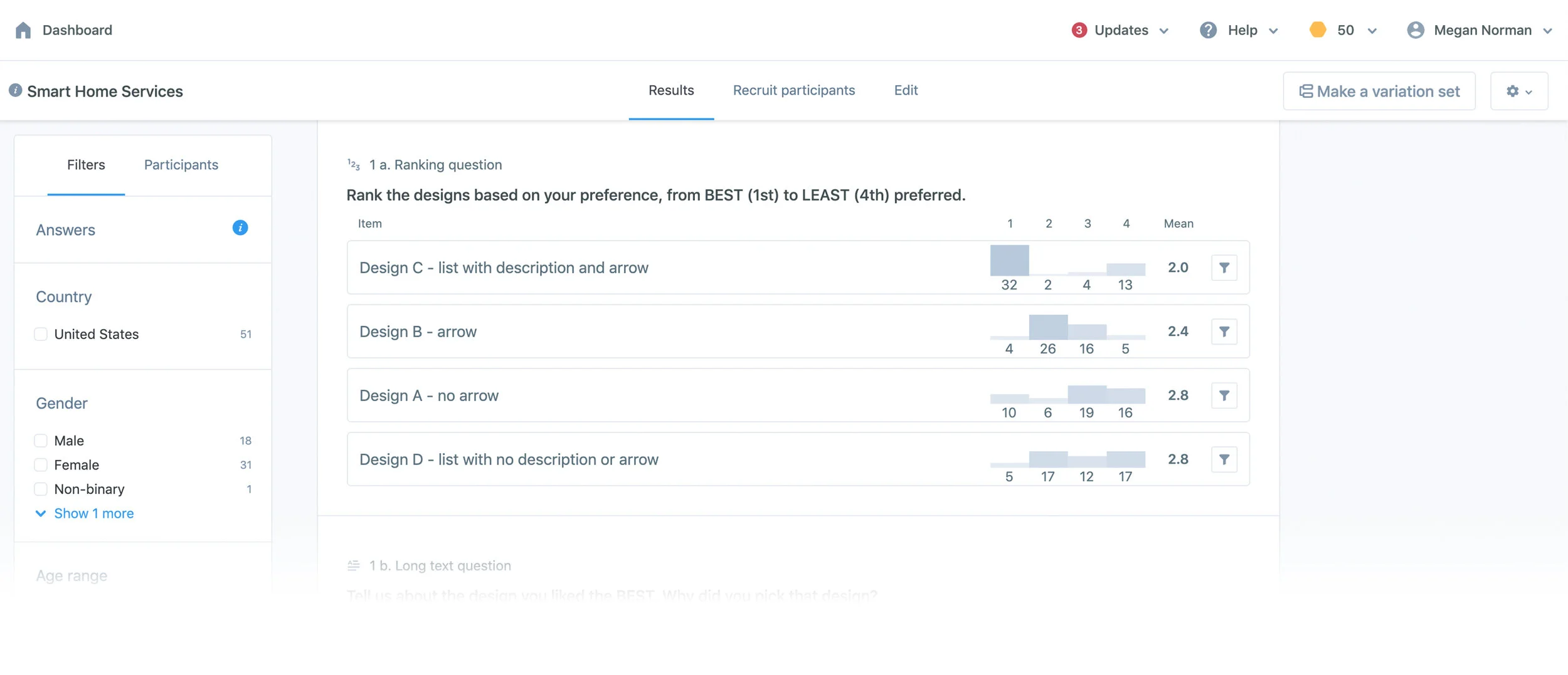
Rank the designs based on your preference, from BEST (1st) to LEAST (4th) preferred.
2.
Tell us about the design you liked BEST. Why did you pick the design?
3.
What about the design you liked LEAST?
4.
Is there anything else you would like to see as part of the design we didn't include? Tell us your expectations.

The Results
We received feedback from 51 participants within a day and the results showed a very clear preference for Option C. Option A-B were about tied for second place and Option D was the least preferred.
"The name and information glimpse is there without having to navigate to another screen."
"This was the easiest to read. I liked the layout."
"I like to know what something is about before I click on the button."

Refining Design
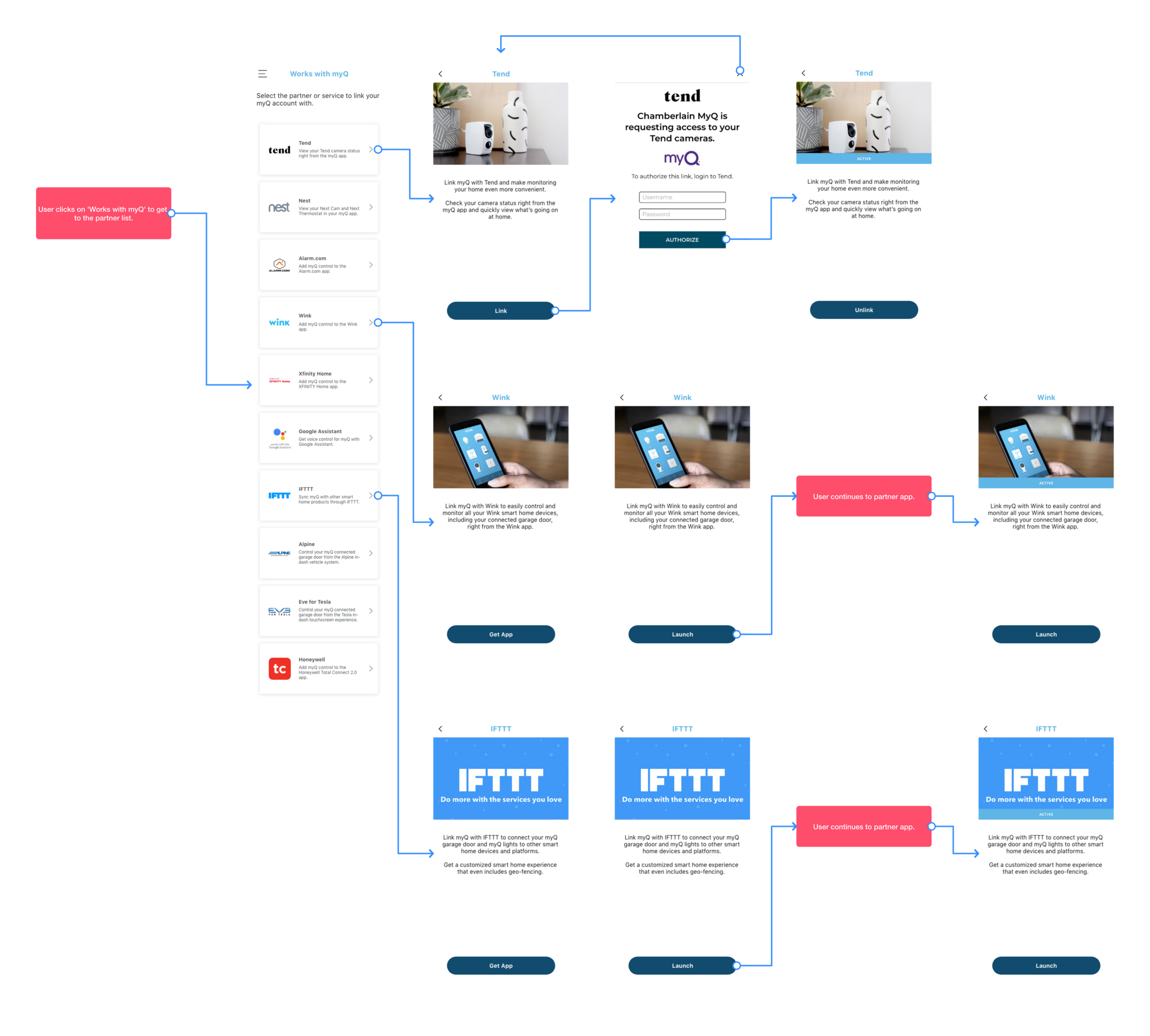
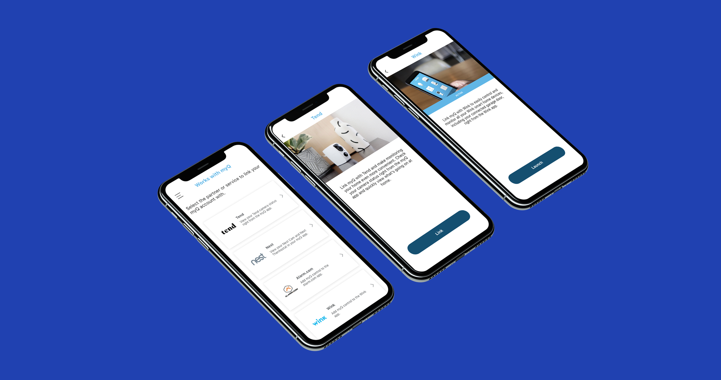
Now that we had the design, I could flesh out the remaining wireframes to complete the user flow, which includes the partner list (tested screen), partner details page, authorization screens and active subscription screens.

Final Screens
Key Takeaways
This project was a great opportunity to introduce new testing methods to improve our user experience. Rather than receiving and implementing design ideas from the top-down, this was our chance to show the importance of direct consumer feedback to improve basic functionality of our apps before moving on to other innovative app features.
The testing results surprised me a bit. On one hand I thought that because people are always on-the-go, having a partner list that was a quick read would be preferred, however, people don’t mind scrolling or taking the time to read brief description text. Even if people don’t have Wink app or use Xfinity, they found value in seeing this information (this would even persuade a user to get that partners’ app). Scrolling has become apart of daily life and, as such, the amount a user has to scroll doesn’t seem to be a pain point in this use case.
Download the myQ app to view the experience.


