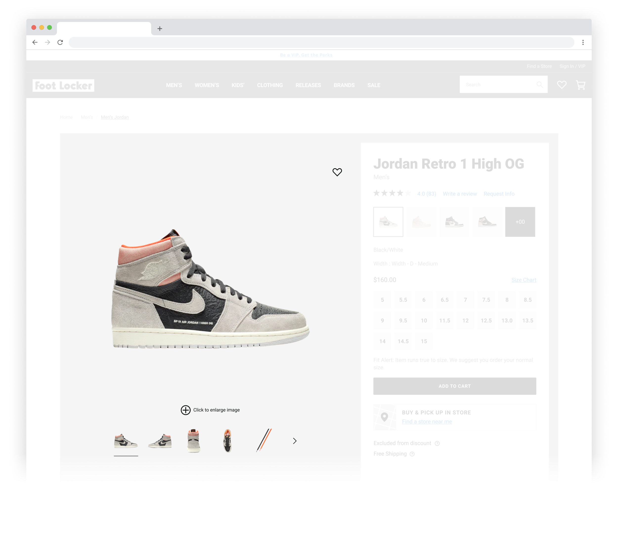
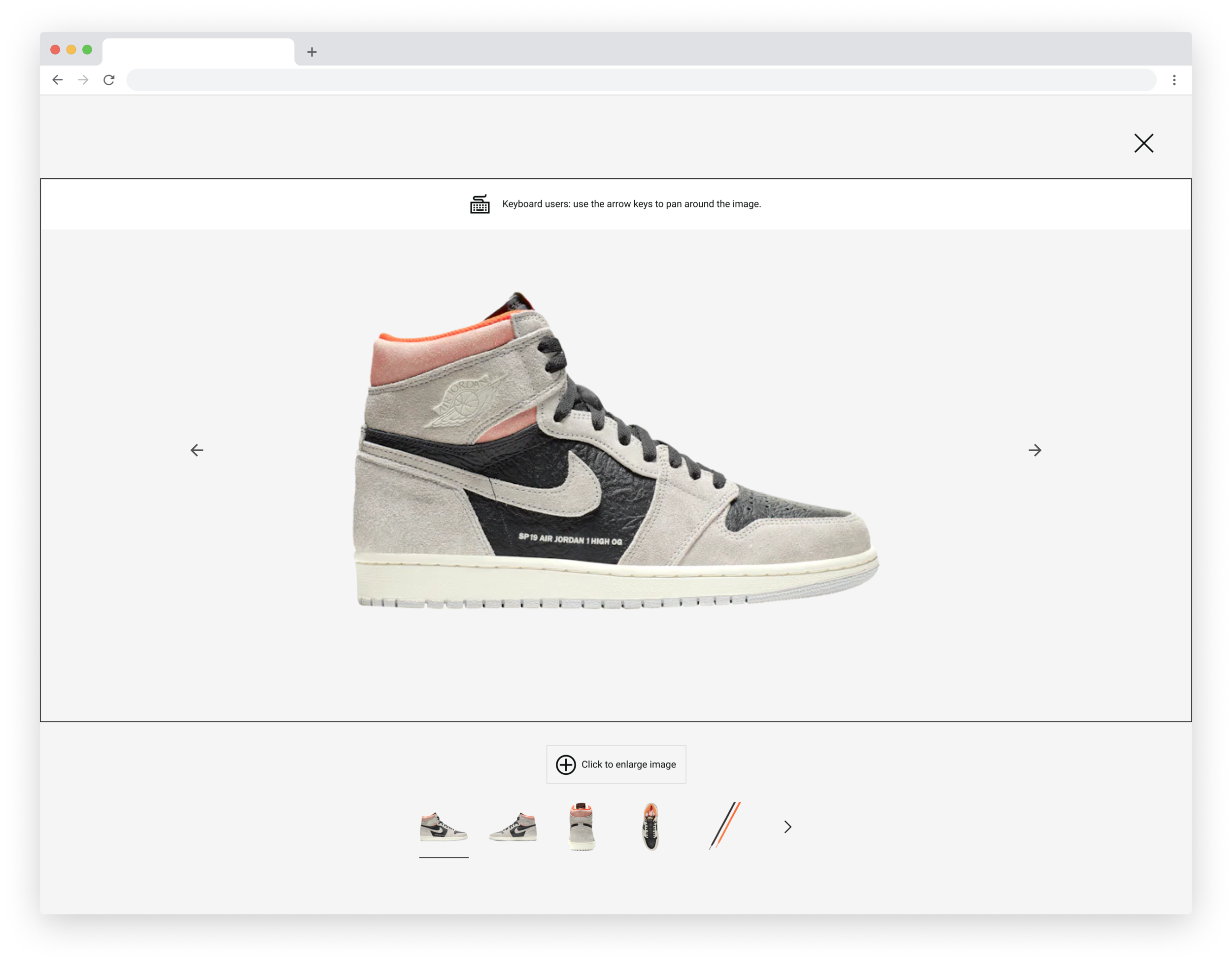
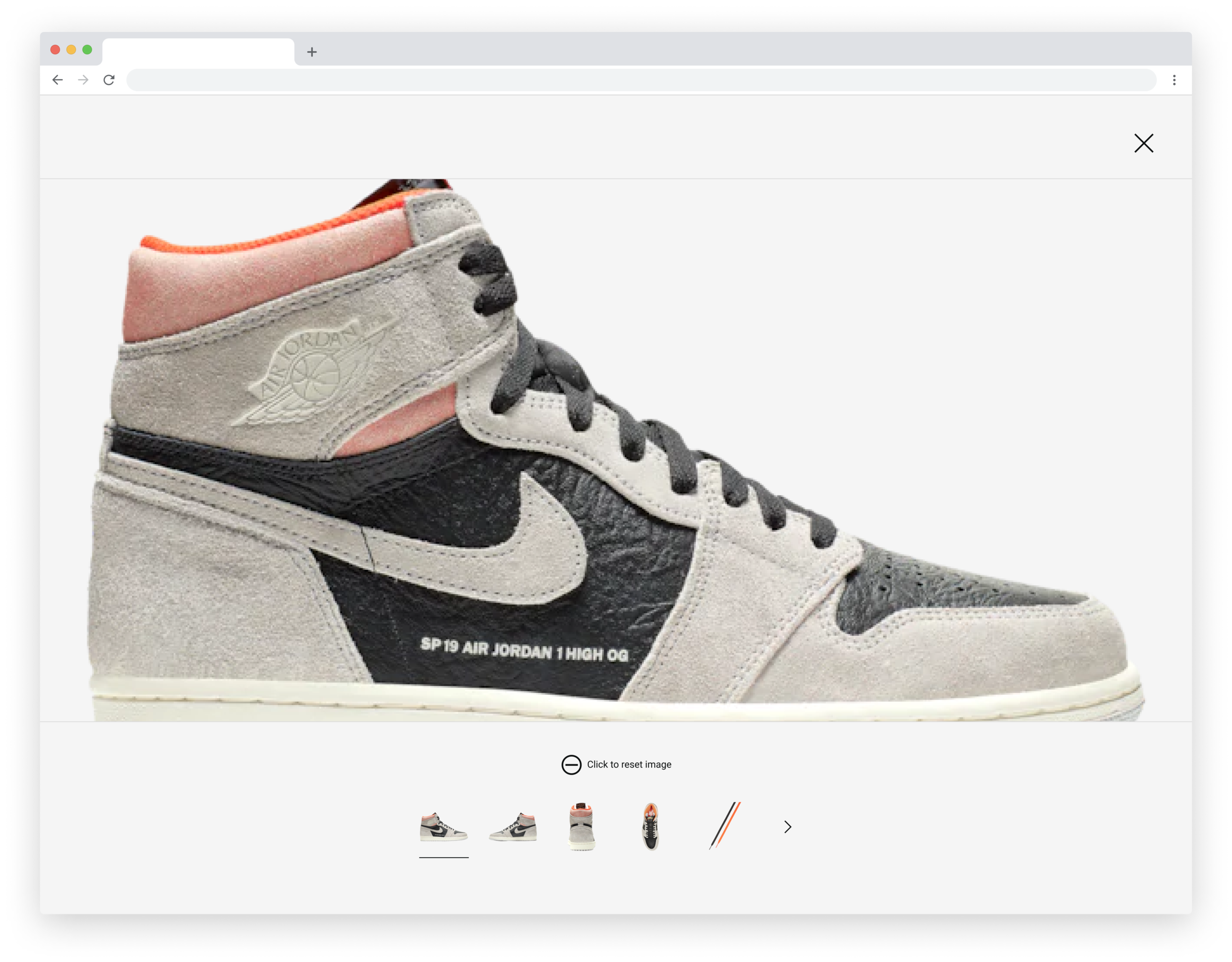
-1up2.jpg


Foot Locker

Samples of work

This is a collection of notable Foot Locker projects between 2019–2021. I've had the privilege to lead UI design on this work with the huge support and collaboration of UX designers, UX writers, UX researchers, product managers and engineers.

This page is currently under construction; a full website overhaul is underway with new, combined case studies for the following work coming soon.

Thank you for your time and patience!


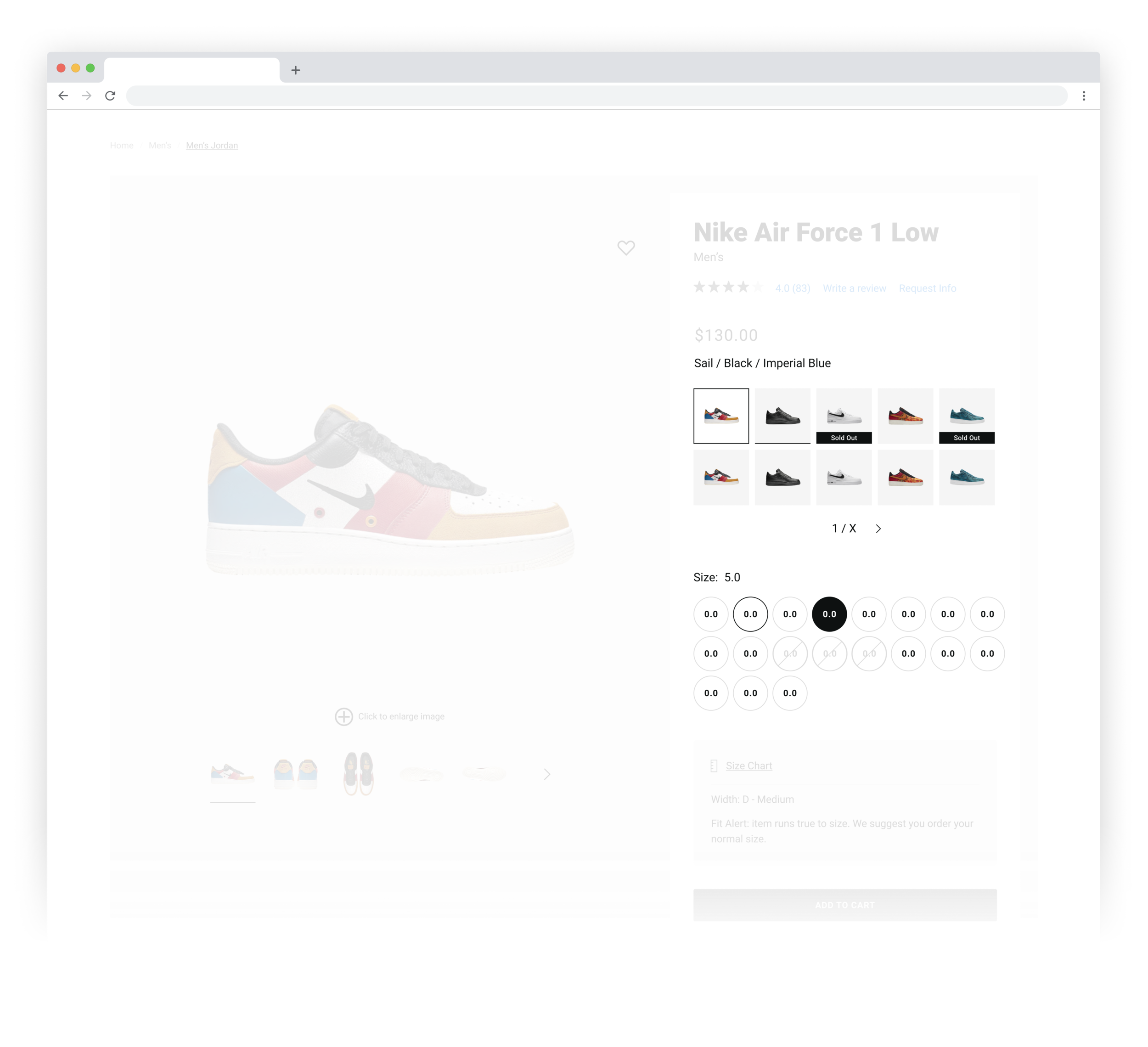
Colorway/Size Selectors
+OOS Badge

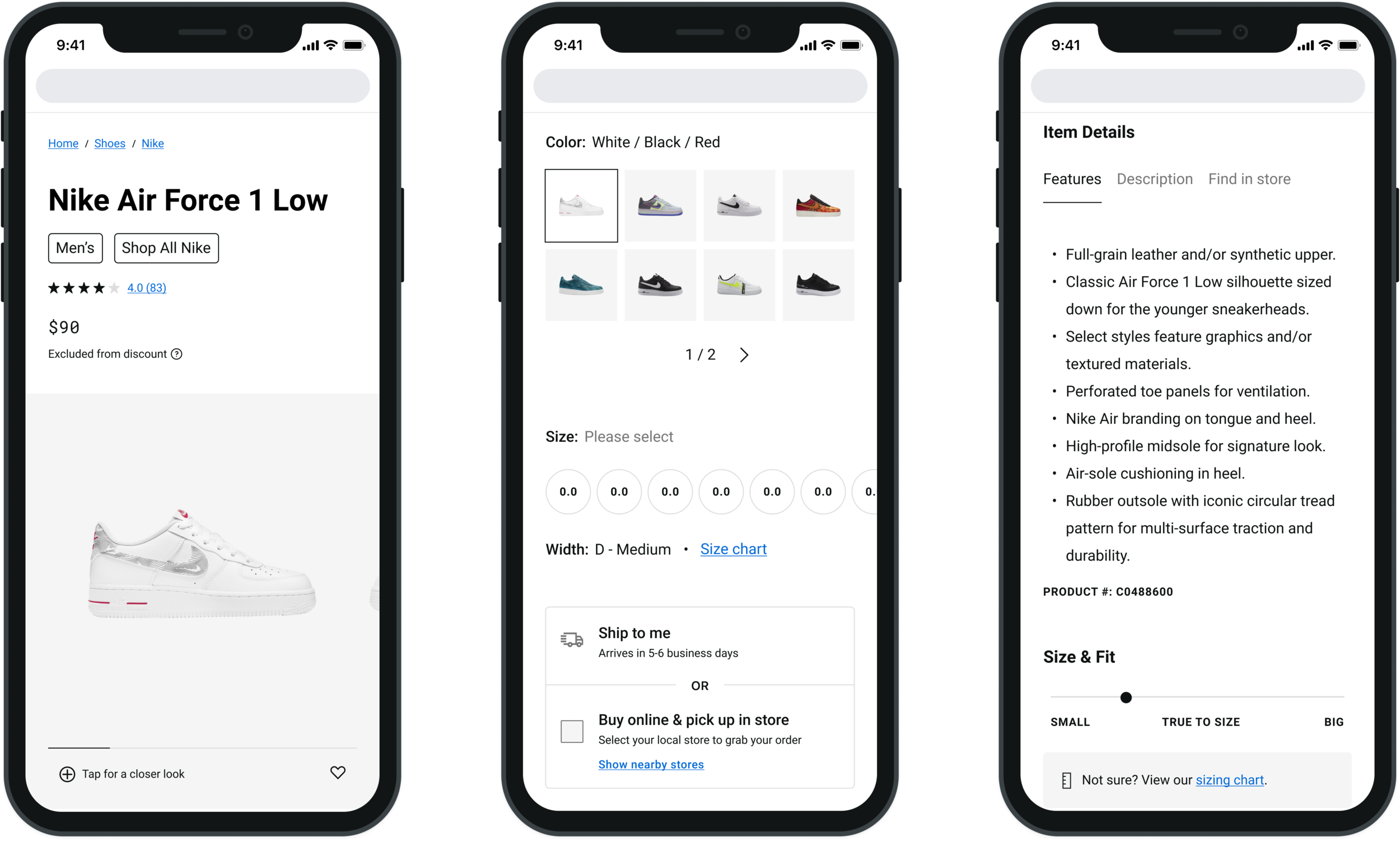
The ultimate goal for color way and size selector milestone was to provide an at-a-glance experience during the product selection process. This was achieved by creating badges to relay out of stock information (removing an additional click from the user), increasing the rows of color way options to two rows to give clearer visibility to product options and by introducing pagination to remove the need for a modal allowing all information to be available at the top-level.

Status: In QA (prior to deployment)


PDP UI Refresh

PDP Refresh is an initiative that builds upon earlier milestones (Photo Gallery and Colorway/Size Selector) by grouping similar content for improved findability, defining patterns and components to create a cohesive system– all while maintaining functionality and staying lean with content to bring our product details page to market parity.

Status: In progress


Search Typeahead

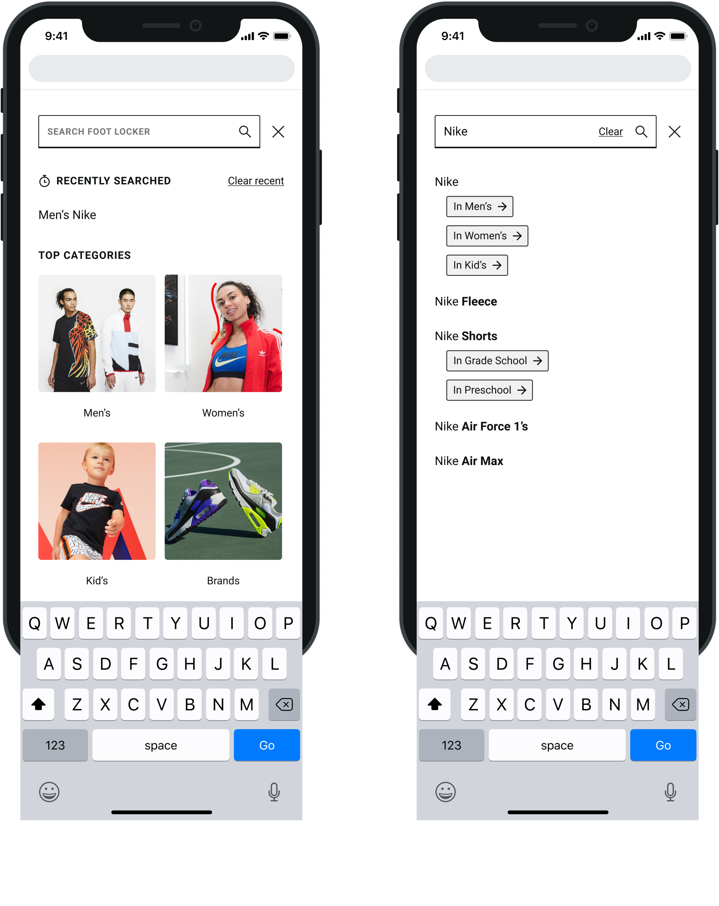
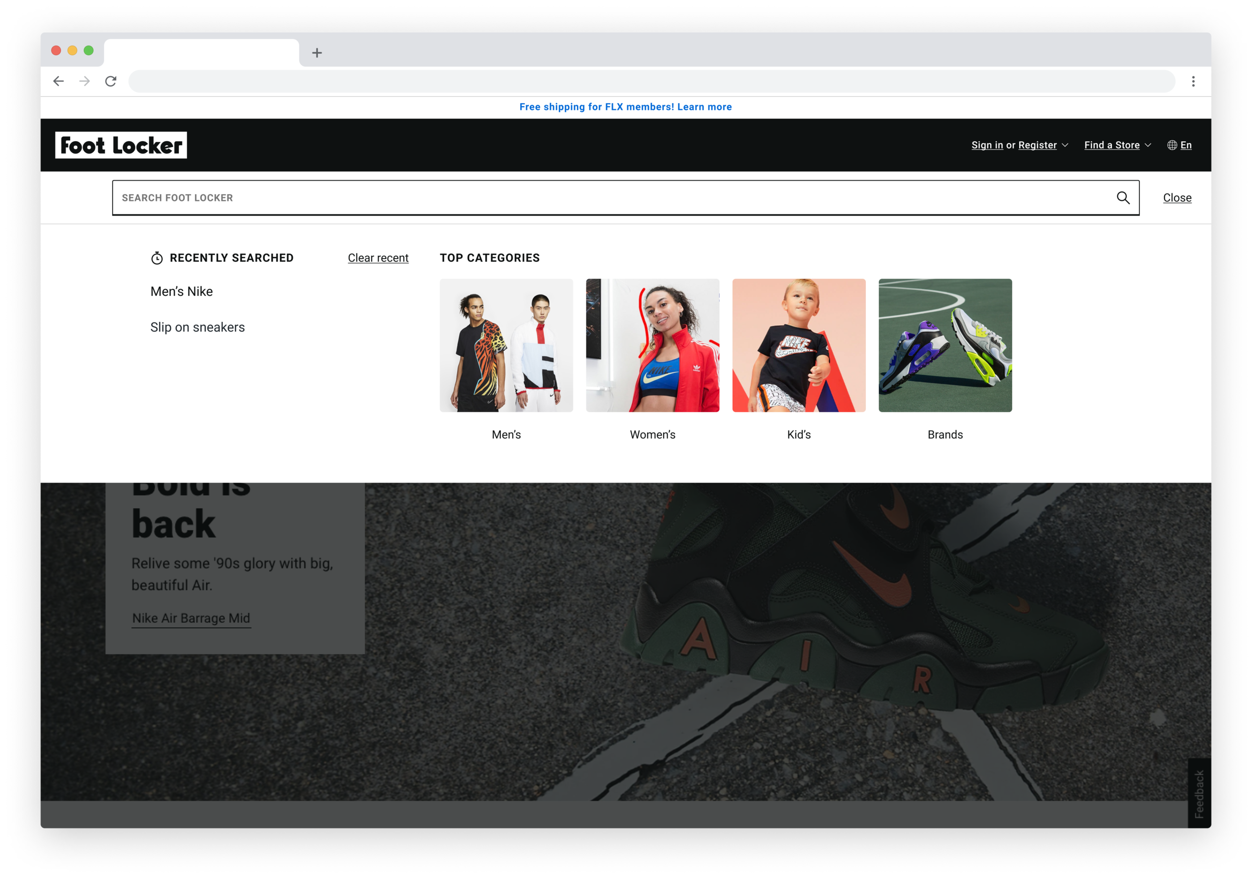
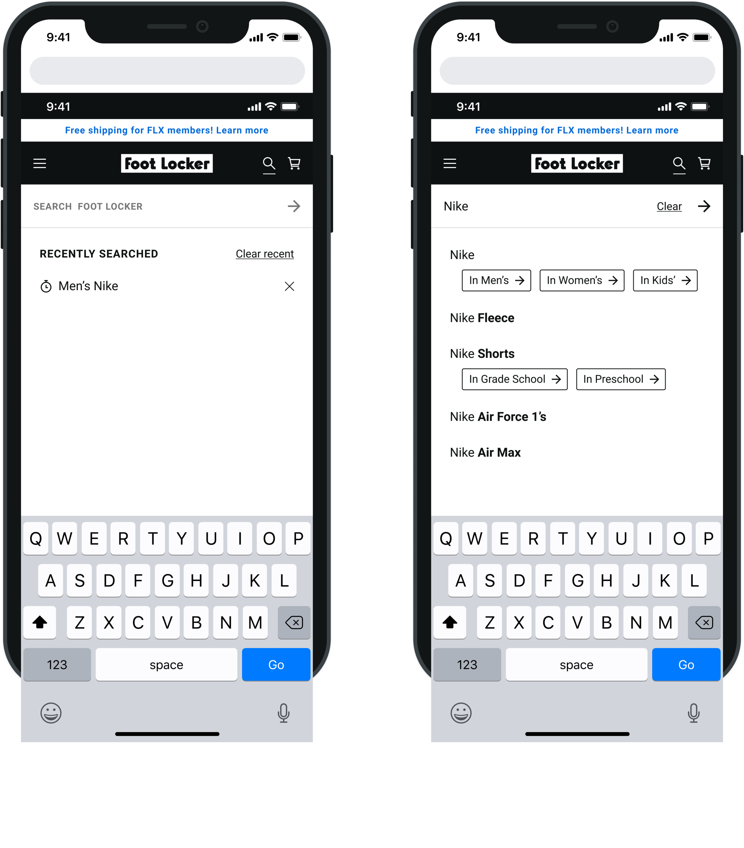
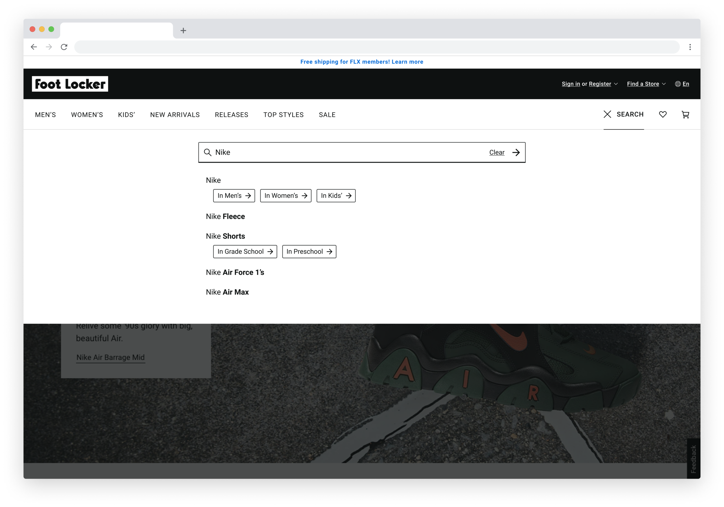
Search typeahead is a new feature that improves upon our current search experience. Search is an important tool for e-commerce, therefore, the extensive changes recommended by the design team needed to undergo user testing to understand what combination of elements were more or less what users expected. We’re currently testing two variants, A and B.

Status: In user testing

 
Variant A


Variant B


Waiting Room Redesign

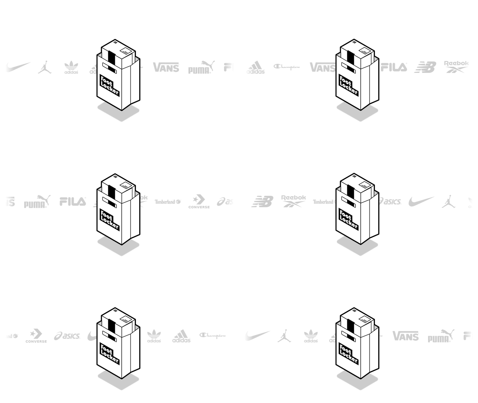
Bot mitigation is a huge problem for any product with a highly anticipated launch. To prevent bad actors from buying new releases en-masse, we’ve instituted Waiting Room: a page that levels the playing field so that our products make it into the hands of our consumers. The goals for this design were to add more information to provide more clarity and manage user expectations as well as add delight with these steady-paced, bouncing shopping bags!

Status: Live on footlocker.com (during product launches)


App Onboarding + Icon Redesign

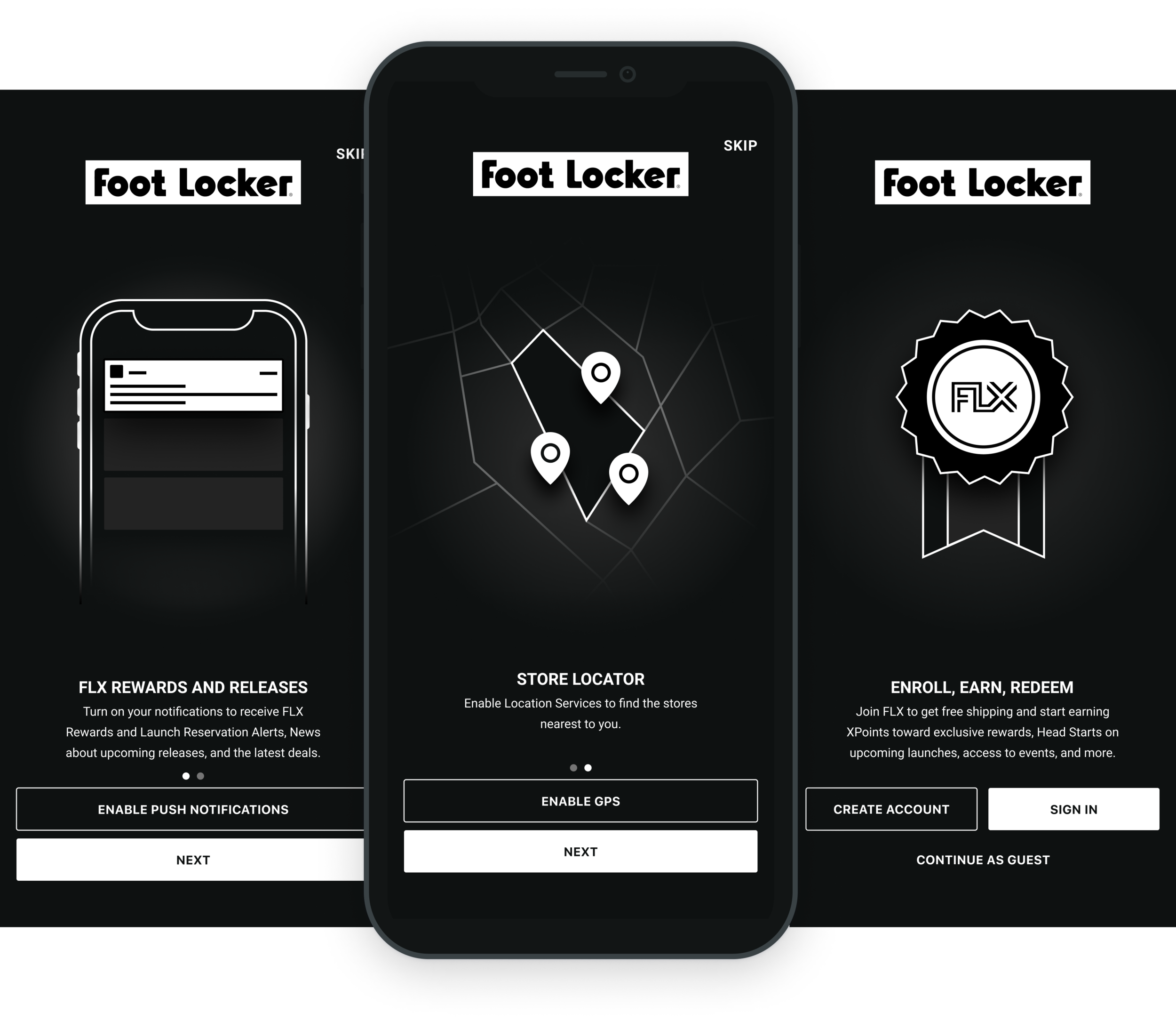
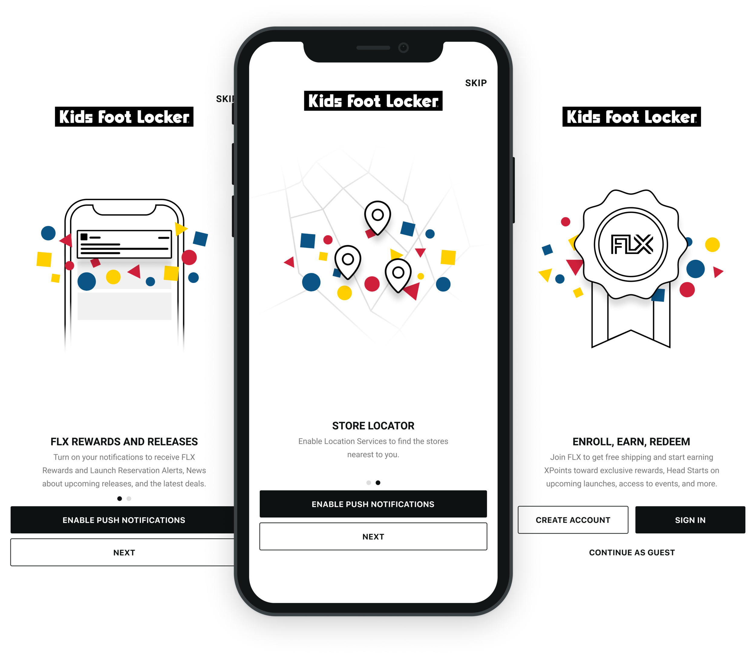
App onboarding was an opportunity to create a compelling first experience for new users. Because omboarding spans across two Foot Locker, Inc. banners, Foot Locker and Kids Foot Locker, keeping in mind each specific brand voice was key to designing a cohesive set that is still unique.

Status: Live for Foot Locker and Kids Foot Locker apps on iOS and Android


Post-Purchase Email Redesign

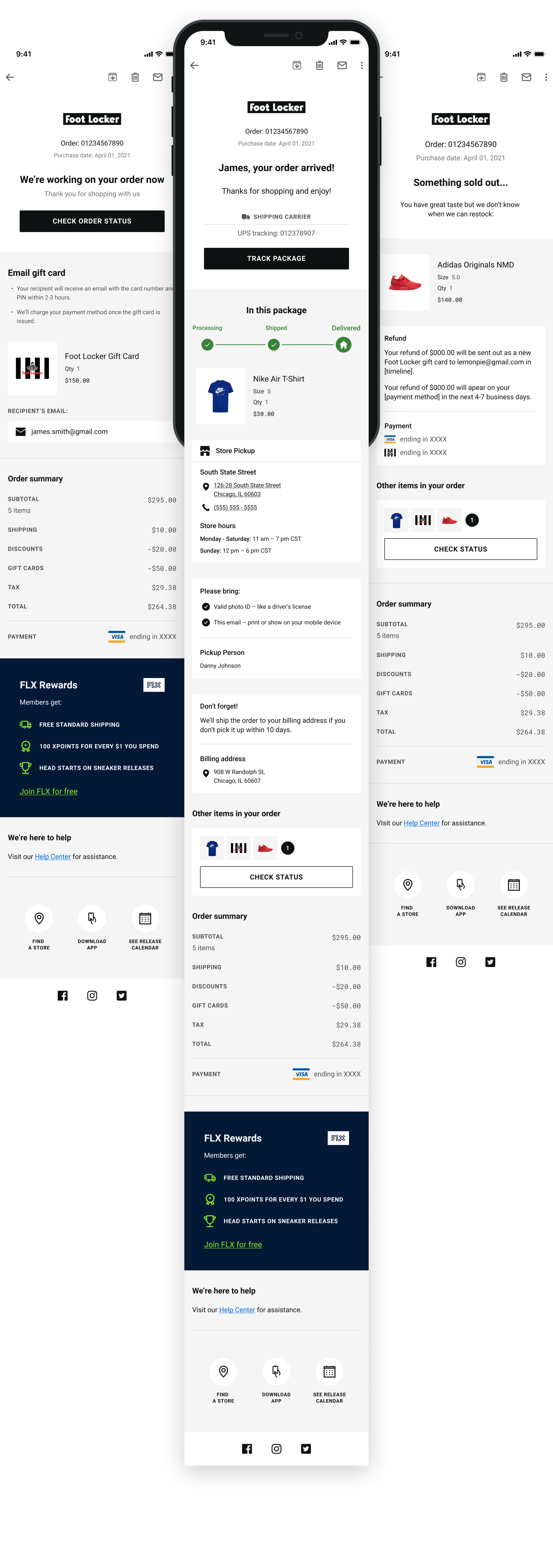
The objective of the post-purchase email redesign was to give users the utmost confidence about the status of their purchase. Because the previous email system was a primarily text-based experience, adding a variety of visual assets was important to bringing overall delight to our users, in addition, providing convenient tools for the user to quickly engage with Foot Locker as needed.

Status: In progress